
BJ’s Wholesale Club
Reimagining membership enrollment across BJ’s digital properties

In an effort to help BJ’s achieve it’s 2023 goal of 1.1m in new enrollments, the digital experience needed an end-to-end redesign.
Role
UX Lead
Activities
Unmoderated user testing - quantitative surveys - user journey maps - information architecture - wireframes - moderated usability testing - LogRocket analysis
The Challenge
Optimize the digital membership enrollment experience with the following goals in mind:
Increase conversion throughout all acquisition funnels (organic, direct mail, social, email marketing, etc.)
Drive higher-tier membership upgrades
Decrease the amount of time between enrollment and a member’s first shop
Improve member education of next steps after purchasing membership
The Process
Mapping out discovery
In order to hit our goals, we first needed to understand the root problems of the existing membership experience and exactly how to solve for them. To do this, we began charting our discovery process, starting with a hypothesized problem statement based on assumptions, website data and a brief scan of the existing experience.
Problem Statement
Today, when prospective members want to enroll at BJ’s, they must distinguish between many perceived membership options, complete a lengthy sign-up process, and follow unclear membership activation instructions. This is problematic because it is difficult to understand each membership tier’s distinct value props, tedious to sign up, and confusing to understand how to begin shopping. This is important because BJ’s is losing out on 96% of all prospective members who begin the enrollment process, and those who do enroll are slow to start shopping.

Understanding the existing experience
In order to design our ideal experience, we first needed to understand areas of friction, drop-off points, opportunity areas as well as how the existing experience was built from a technical perspective. This entailed collaboration with the analytics team to uncover metrics such as time on page, abandonment rate, drop-off points; and a detailed audit of every enrollment journey.


Exploring competitive & UX best practices
We conducted a competitive audit of membership experiences across over 20 different sites; from gym membership enrollments, to SaaS plan signups, to magazine subscriptions, to co-working space registrations to learn how to best present membership options, as well as gauge common enrollment form inclusions.

We gathered from website data that the enrollment form itself was an extreme area of friction and drop off, so we sought after technical UX best practices in order to streamline.


Conducting user research
Quantitative Survey
Once we had a better idea of design direction based on initial discovery tactics, we began testing design variations, learning how to best upsell higher tier membership, and understanding what prospective members value most in terms of membership benefits. To gather these insights, we first conducted a Qualtrics survey amongst 4,000 respondents. Survey questions included:
Imagine you're interested in purchasing a BJ's Membership and want to assess which Membership plan is right for you.
Which option presents the differences between the 2 membership plans most clearly?
In which option does the Club+ Card Membership seem most compelling?
What makes it the most compelling in the option you chose?


In which intro design is it easiest to understand how you might change the page from individual memberships to business memberships?


Review the design options for communicating BJ's service offering, then BJ’s digital conveniences. Which layout is the most clear and compelling?


User Testing
The research was pointing us to a completely new experience whereby users both completed membership enrollment and payment in one form, on one page. However, the development team first had to assess feasibility of this from a technical perspective as well as within the launch time frame we had. We thus created an interim new experience incase we had to phase the redesign in multiple launches. We user tested this new experience to understand areas of friction, as well as to understand the effectiveness of membership upgrade communication throughout. Our results were extremely helpful for our final design:


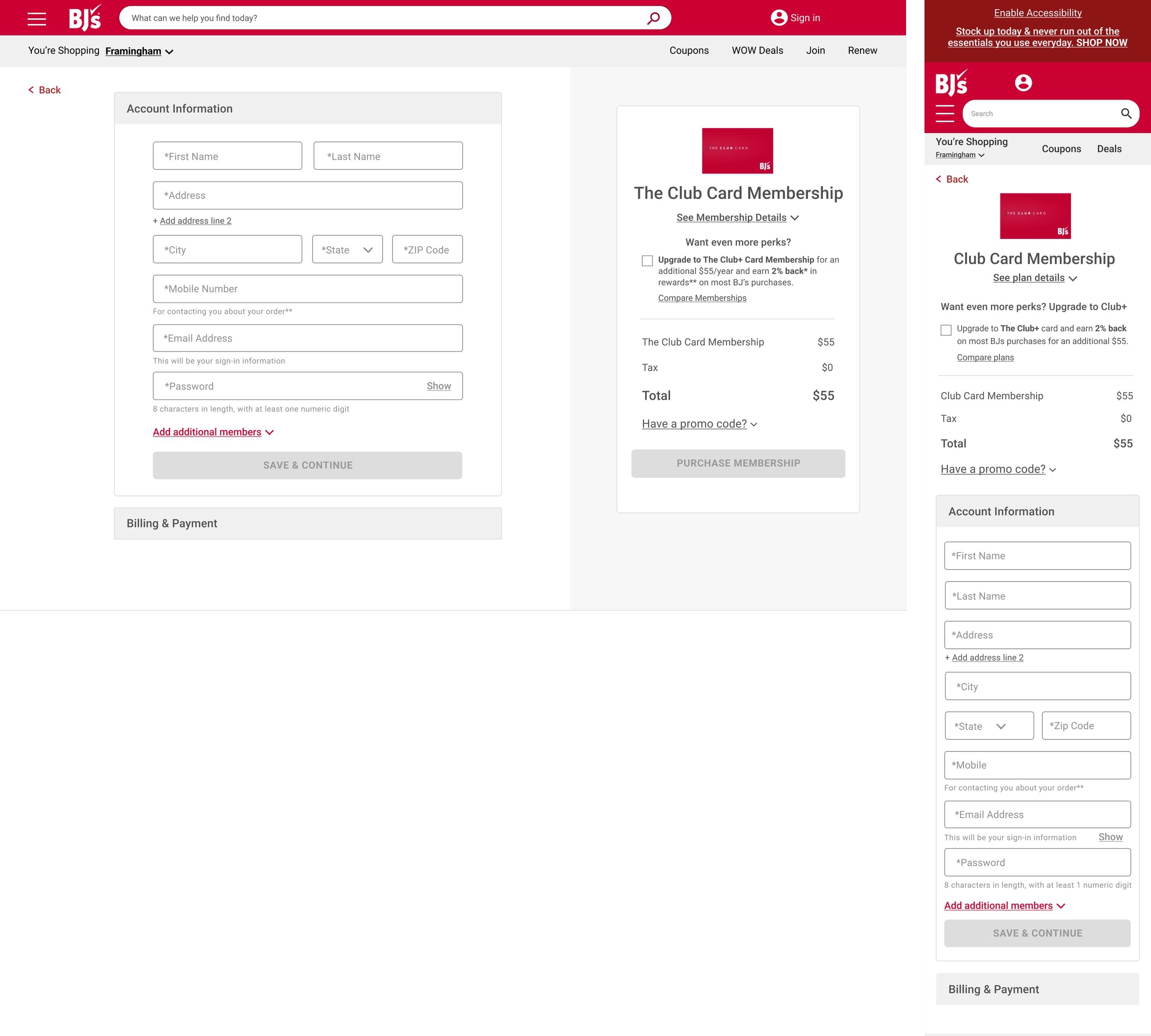
The new experience
Luckily, the development team was able to achieve the one-page membership enrollment solution that incorporated billing & payment. With this solution we were limited in UI potential as we needed the form to have parody with site checkout. The one-page enrollment not only improved the user experience immensely by vastly cutting down steps and cutting out friction, but it also reduced confusion over how to redeem membership promotions. Discounts in the previous experience were not applied until cart, while this new experience applied them right away, boosting prospective member confidence that their promotion would be honored.


Results
Membership conversion rate increased from 4% to 17% from 6 months prior to launch —> 6 months post
Higher-tier membership enrollments increased by 55%
Negative feedback related to membership decreased by 20% from 6 months prior to launch —> 6 months post
29% more new members made another purchase during their enrollment session the 6 months after launch compared to the 6 prior
Add to carts on the confirmation page increased by 14% from 6 months prior to launch —> 6 months post
Change Statement
We’d like to change the experience of selecting, signing up for and activating a membership in order to achieve higher membership conversion, increase higher-tier signups; and inspire new members to begin shopping faster.

Discovery Objectives
Understand...
Friction points of the existing experience
Technical feasibility and limitations with regards to streamlined approach
Required sign up information vs. optional/collapsable
Common membership option page paradigms
What value propositions are most compelling to prospective members
How to upsell higher-tier membership in a way that doesn’t disrupt the experience
How to best redesign order confirmation page to be an educational resource vs. a strictly transactional step
Discovery Goal
Decide how we can best present membership options, streamline sign up and educate new members on next steps.

Research Plan
Research Methods per Discovery Objective…
Benchmarking test via Usertesting.com & analysis of existing data
Engineering spike
Stakeholder interviews
Competitive audit
Quantitative Survey & A/B testing
Quantitative Survey, user test of redesigned experience & A/B testing
User test of redesigned experience
Learnings & improvements for next time
Never actually did a TRUE benchmarking User Test due to timing constraints and resourcing — would have been very helpful
Similarly, tight timelines and resources hindered us from carrying out A/B tests
We were limited to using copy from other membership paraphernalia vs. being able to test different phrasings of member benefits
It was the first time that the UX team worked super closely with the Digital Creative team and it was our responsibility to be more firm regarding layouts based on testing results.